Rosser Truck & Trailer Repair

- Mechanical Identity: A logo that strongly represents their core business in truck and trailer repairs, incorporating elements of machinery or tools.
- Bold and Dynamic Colors: The client wanted bold, eye-catching colors like red and black, representing strength, urgency, and the industrial nature of their work.
- Easily Recognizable and Versatile: The logo needed to be distinct and easily identifiable on their branding materials such as business cards, signage, and online platforms.
- Incorporation of Text: The company name and a clear representation of their services were required in the design, with an emphasis on keeping the text integrated into the visual elements of the logo.
- Professional and Modern Appeal: The client requested a logo that feels modern, with a professional touch, to appeal to their customer base while symbolizing trust and expertise.
Solutions Provided
Concept and Design Approach:
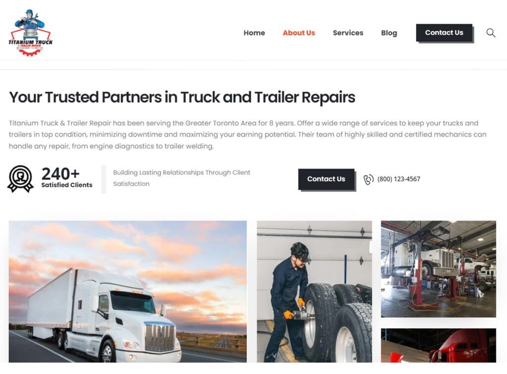
- We integrated mechanical elements like gears, wrenches, and pistons into the design, showcasing the technical nature of Rosser’s truck and trailer repair services. The gear at the top represents the machinery they work with, while the wrenches and pistons symbolize the tools of the trade.
- The red and black color palette aligns perfectly with the client’s request for boldness and industrial strength. Red conveys urgency, energy, and power, while black brings in an element of sophistication and professionalism.
Typography and Banner Element:
- We included a banner below the central mechanical illustration to house the company’s name, ensuring it’s legible and well-integrated with the overall logo design. This gives a classic yet professional feel, adding to the visual balance of the logo.
- The font chosen is clear and modern, reflecting the company’s professionalism and reliability.
Scalability and Versatility:
- The design was crafted to work across multiple formats—whether on small business cards, larger signage, or digital media, the logo retains its clarity and impact.
- Variations were provided in monochrome for specific use cases, ensuring adaptability across various branding applications without losing the brand identity.
Symbolism:
- The gear and wrench icons prominently feature to emphasize their hands-on mechanical expertise, while the bold circular layout gives the logo a solid, balanced appearance, symbolizing the well-rounded services that Rosser offers.
- The symmetrical design ensures an aesthetically pleasing and professional look, which reinforces the company’s reputation for quality service.


